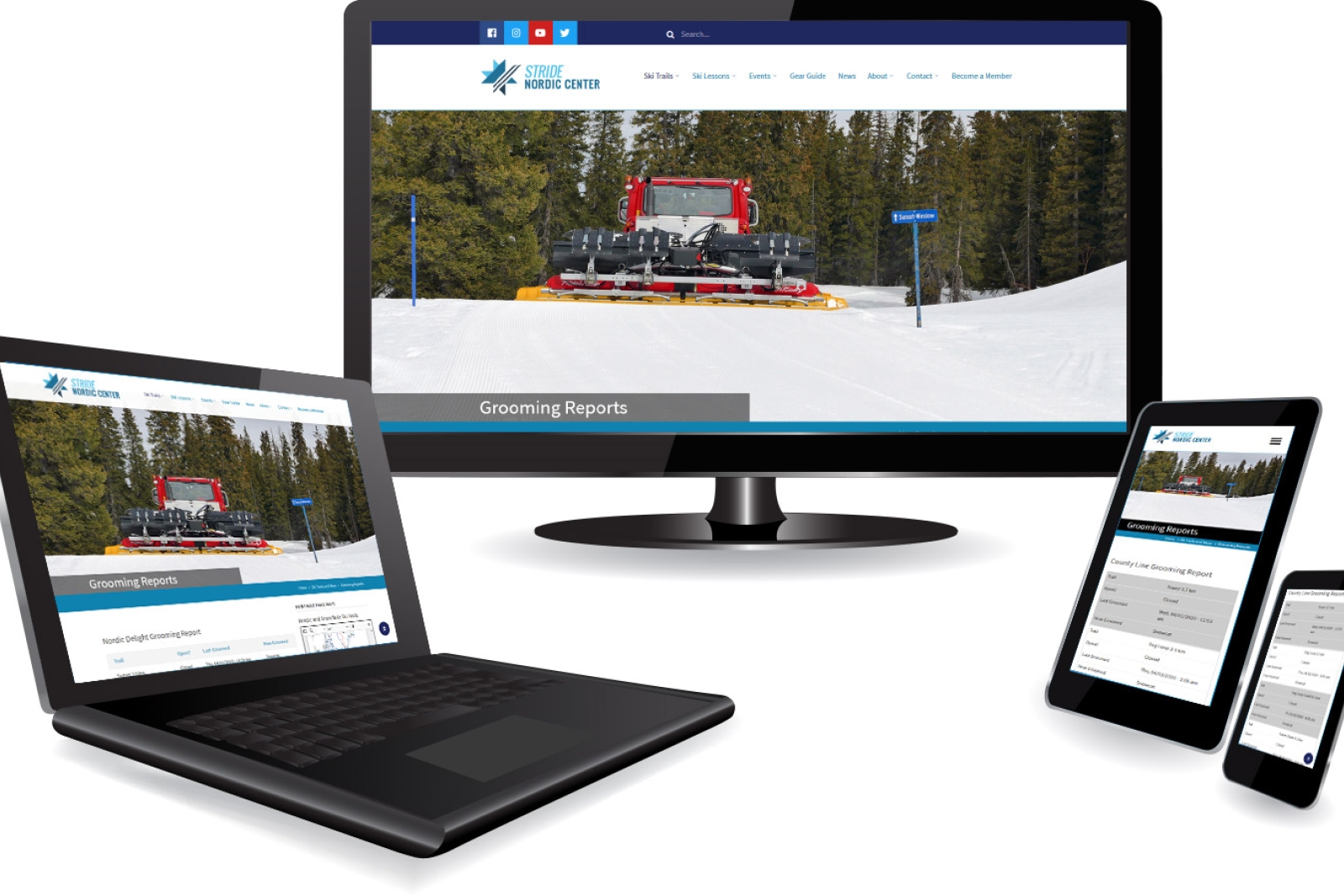
The Nordic Center website is a fully responsive website.
The Nordic Center website is built with mobile-first approach (“responsive”) so that it automatically responds to the visitors’ behavior and environment. As the user switches from laptop to tablet or mobile, the website automatically accommodates the resolution, screen size, screen orientation, and the processing ability of the device used to access the website. The technique and the technology used to build such websites are called Responsive Web Design, and the websites built in that manner are called "responsive websites."
Yours staff will also be able to use any device to manage the public-facing and back-office functions of the website, such as managing all content, process orders, update grooming reports, post news, publish newsletters, job openings and more.
